Logos, palettes, brand voice and digital
An identity that still works at the size of a business card and the size of a building
- An identity is a palette, a typeface, a way of writing and a short set of rules for using them. Get those right and everything made afterwards already looks like it belongs, whoever makes it.
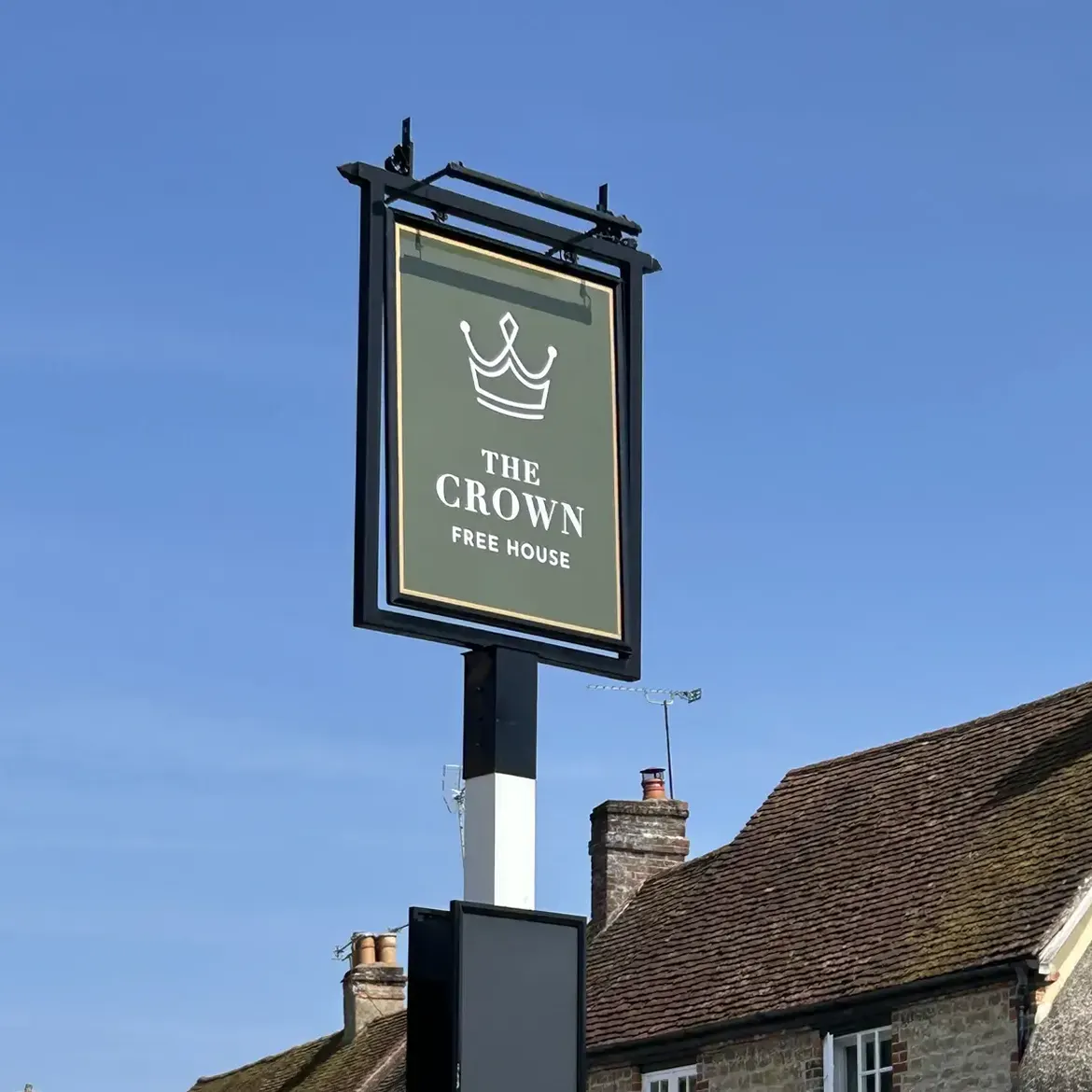
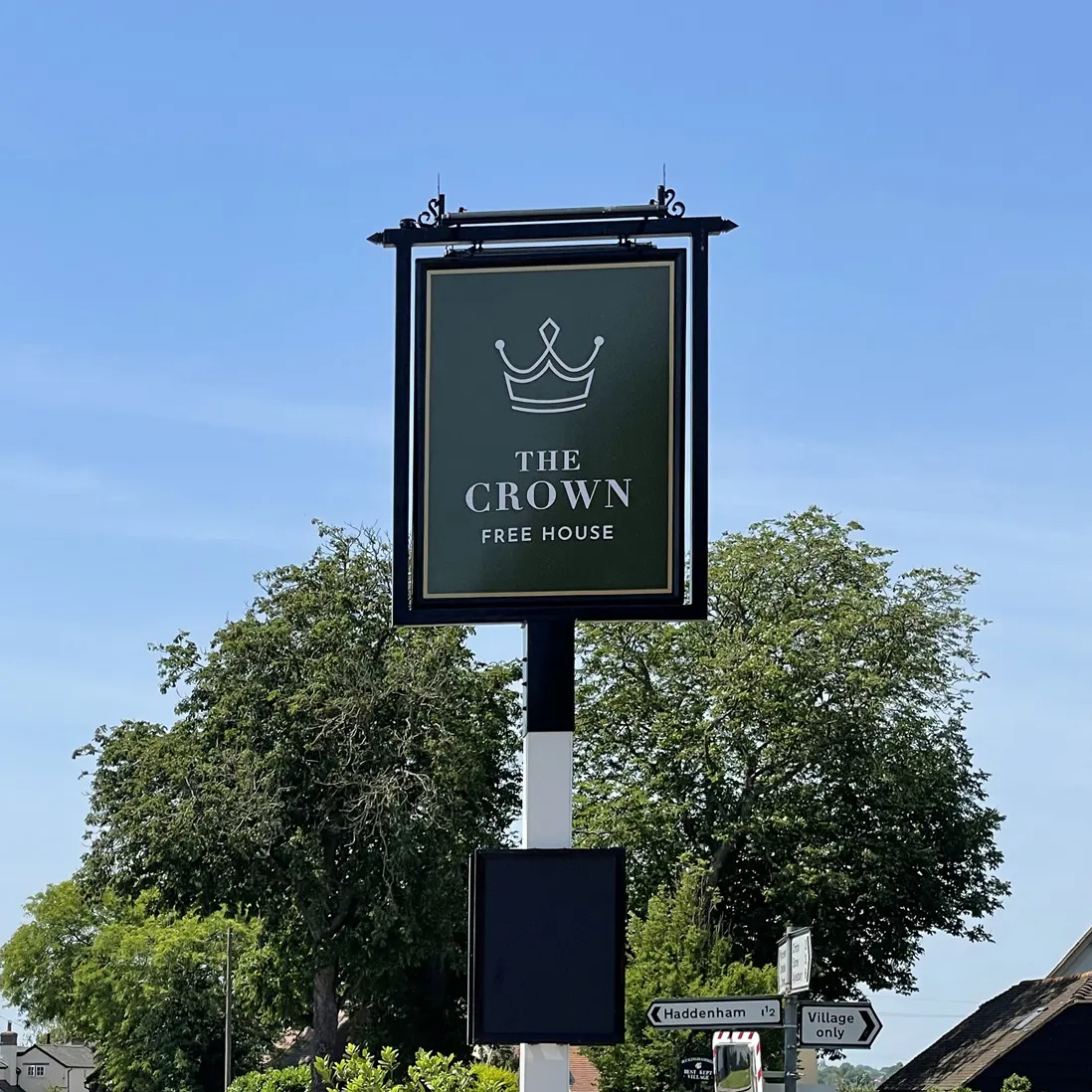
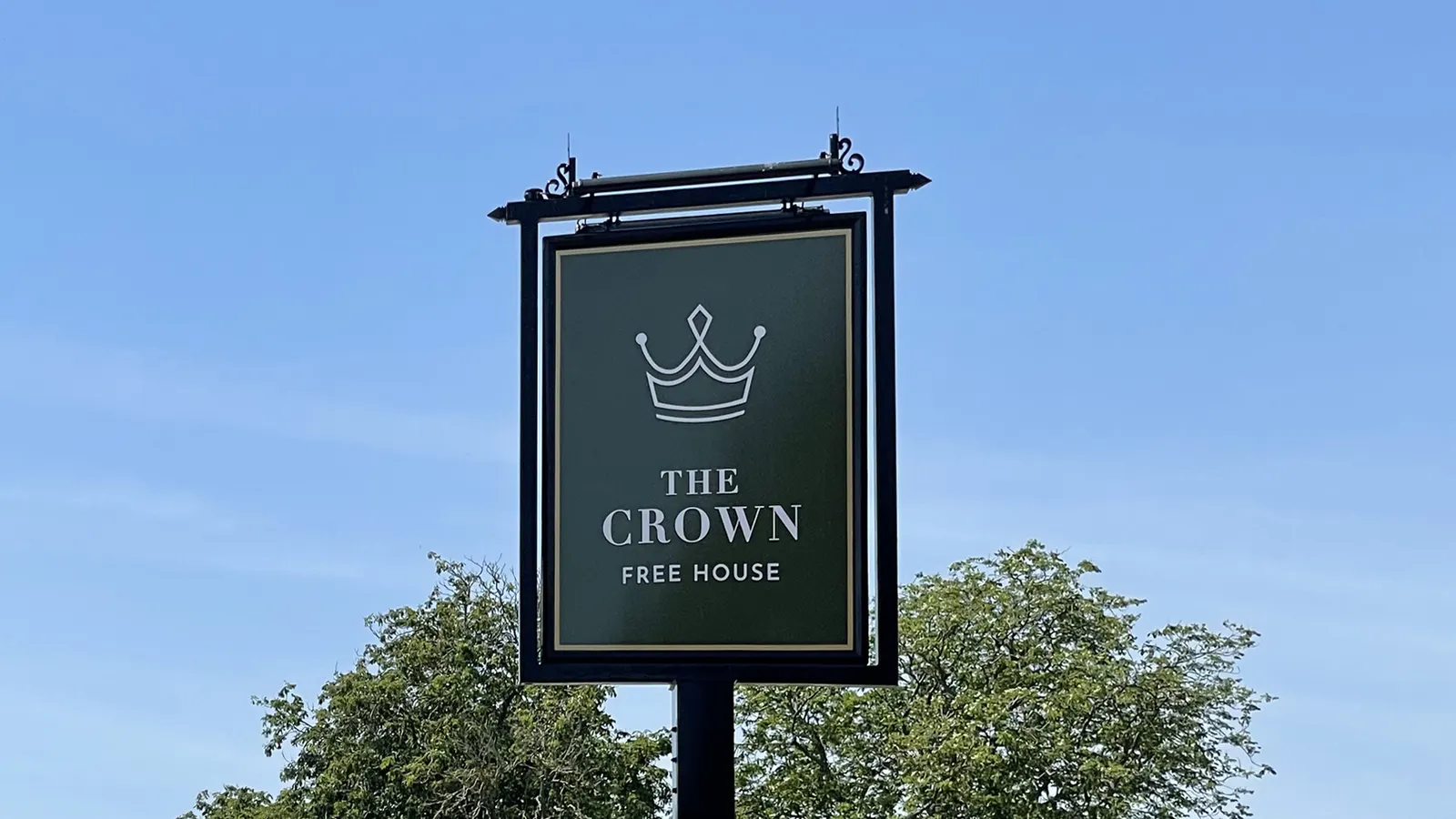
- Where there is history worth keeping, we keep it. A rebrand does not have to throw away what people already recognise - and where a name has been over the door for generations, throwing it away would be the wrong answer.
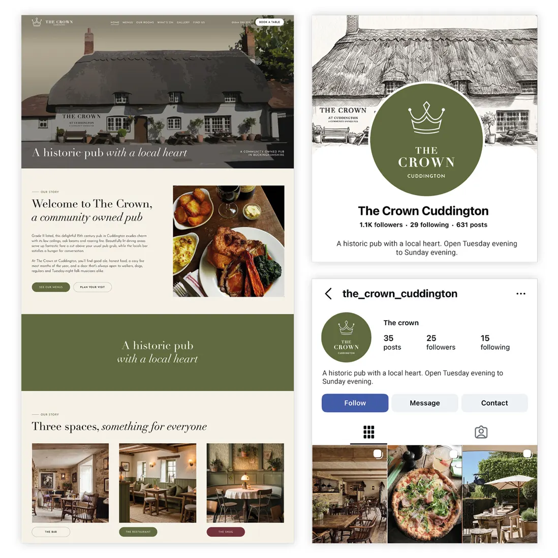
- Most people meet an identity on a screen first, so the digital side is designed alongside everything else - the website, the social profiles, and a version of the mark that still reads at the size of an app icon.
- You get the artwork in every format you will actually need, with the colour breakdowns for print and for screen, so the next person to order a menu does not have to guess.